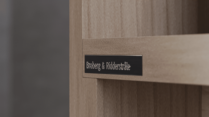
Broberg & Ridderstrale – Bench
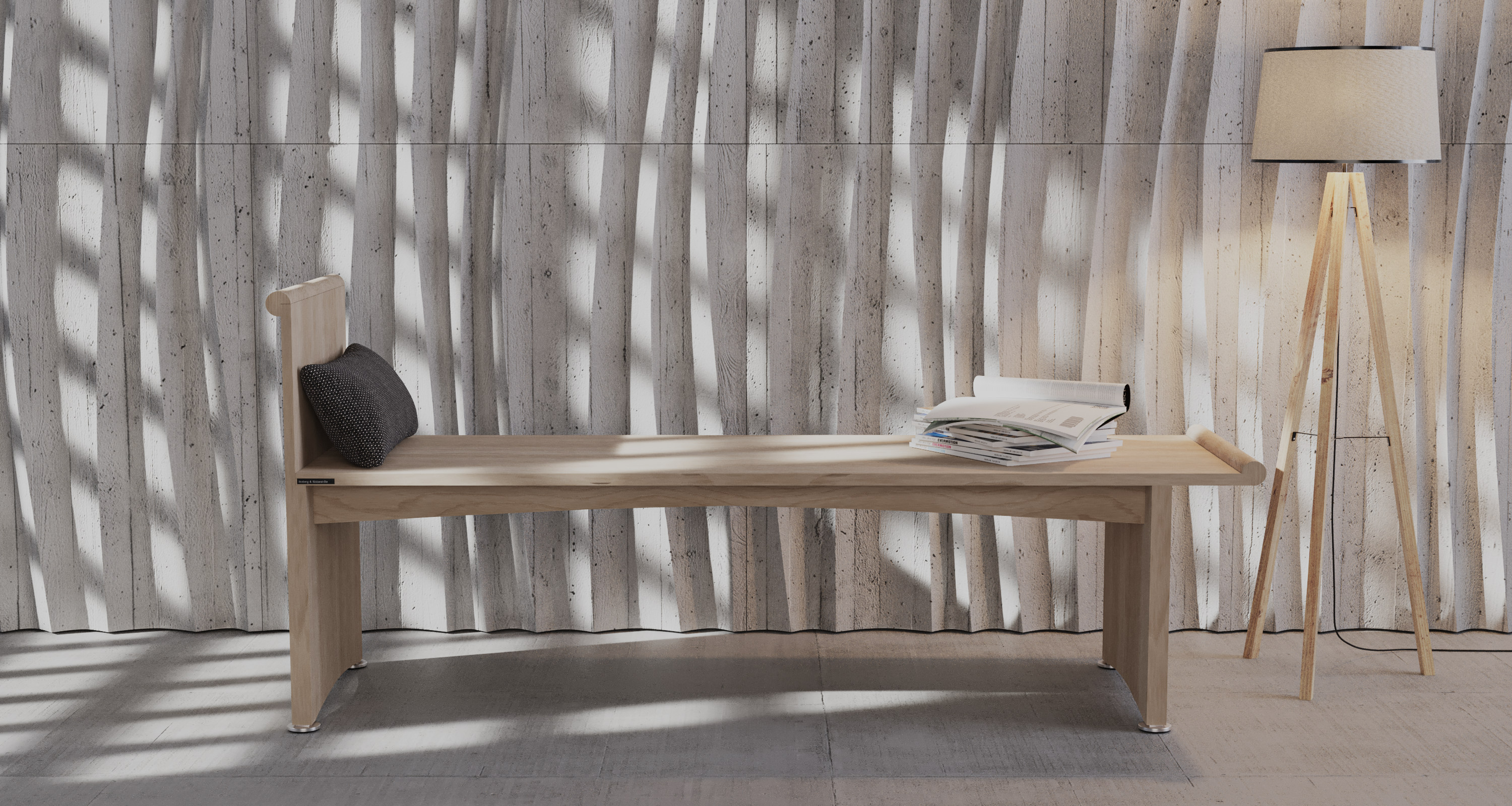
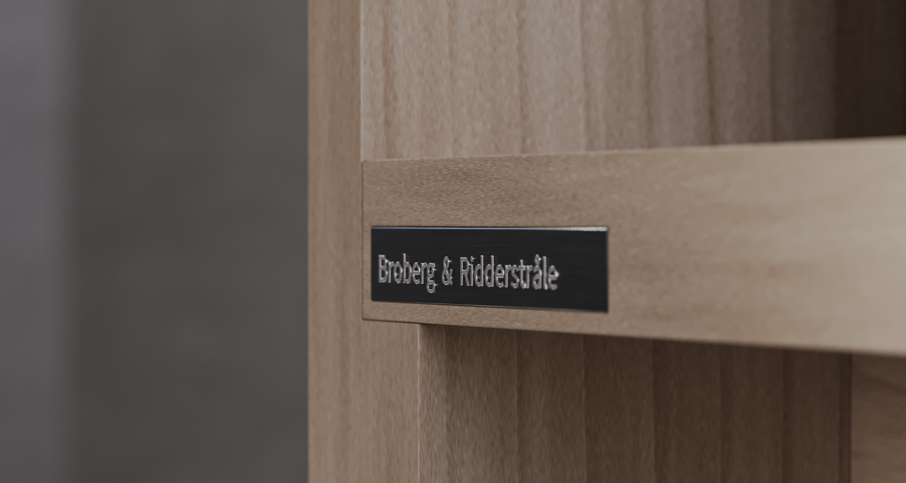
A few days ago, I discovered an interesting piece of furniture designed by the Swedish studio Broberg & Ridderstråle in an article on the YANKO DESIGN website. Somehow I found this bench very appealing in its very own way. The mixture of „old school“ and modern, minimalist look has something, which is why I decided to recreate it.
The first thing I did was try to find out more about this piece of furniture, but unfortunately there isn’t much information available, apart from a few pictures. Even the official website of „Broberg & Ridderstråle“ at www.muuto.com doesn’t show the bench. But I discovered a page where this bench is offered with the sonorous name „Swedish Pause Bench“ and there I also got the dimensions for the bench, which was really great.
I then packed everything that was important to me for the project into a „PureRef file“ as a reference. At first I wanted to create my very own design variant in terms of materials, but then I thought that I should first create the bench as realistically as possible and as close to the original as possible and only then and at a later stage design my own creation.
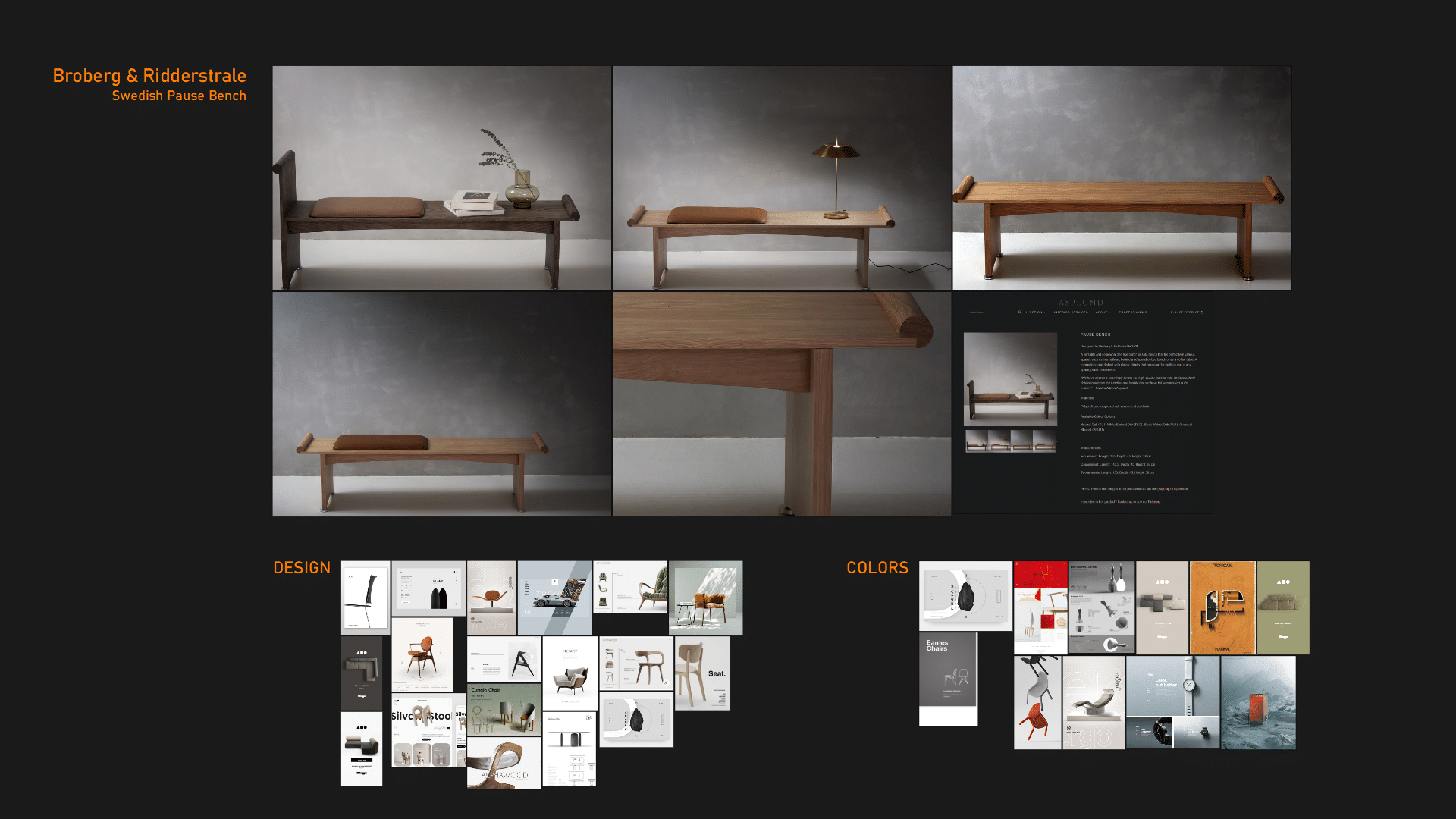
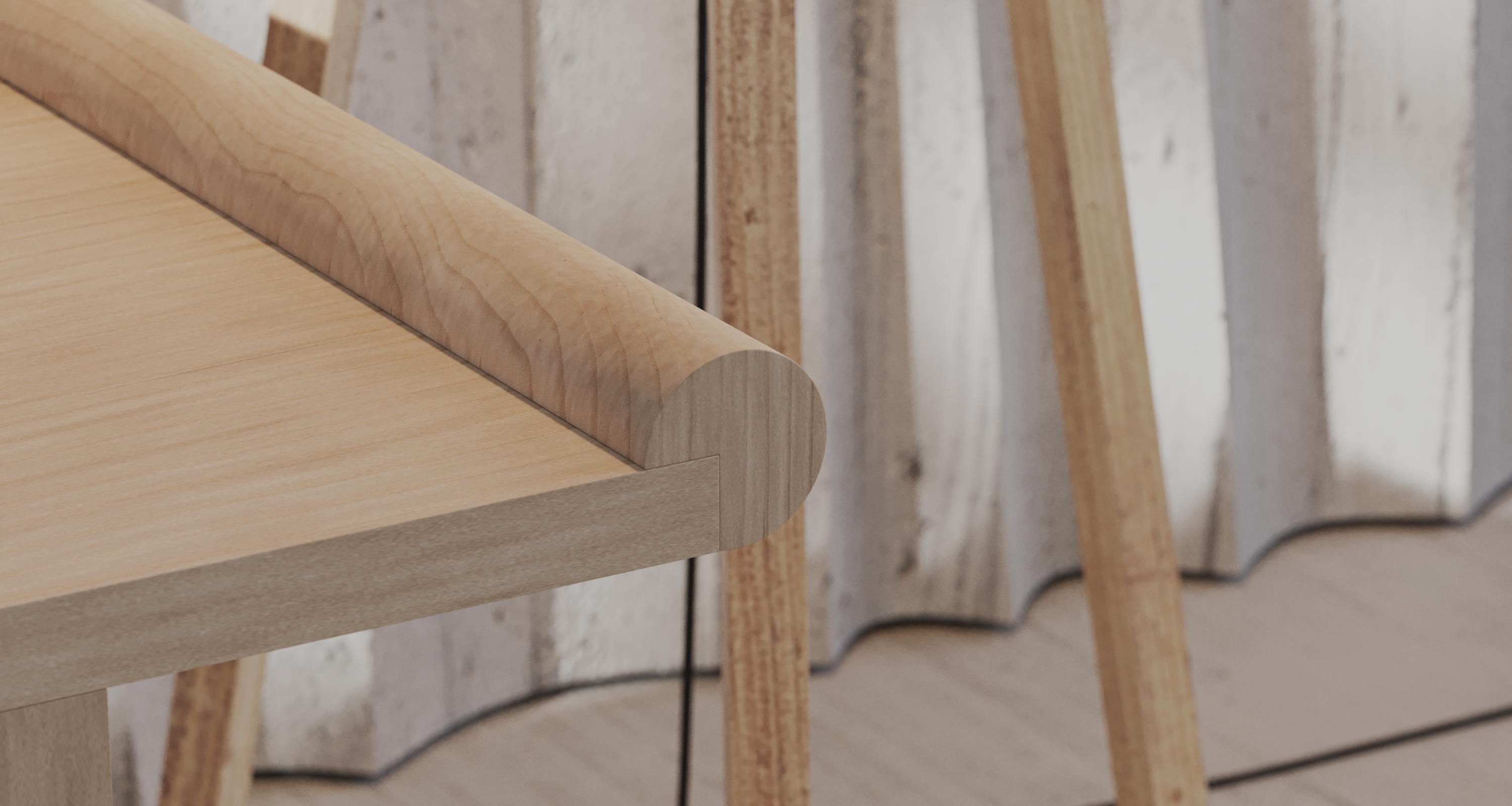
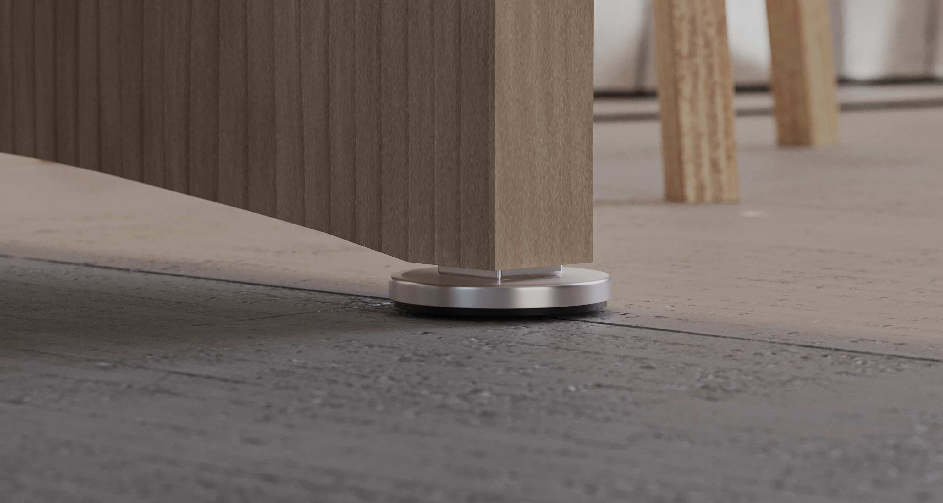
The modeling process for this bench, as you can see, is not very complex and was not a big deal for me. I was more concerned about the subsequent texturing. Finding the right wood texture is one thing, but I didn’t want to go that far, because in 3ds Max there is a really good integrated procedural wood shader with which you can create different types of wood very well if you pay attention to the right settings or familiarize yourself a little more deeply with its settings and conditions.
Of course, I couldn’t leave the bench on its own and so I made a few attempts to present the bench quite neatly. The first room I modeled didn’t fit, the second didn’t either and by the third I realized that less is probably more. I definitely didn’t want just a smooth and plain wall, but something dynamic with a bit of movement and so I came up with the idea of creating curved panels for the wall, which wasn’t a bad idea in itself.
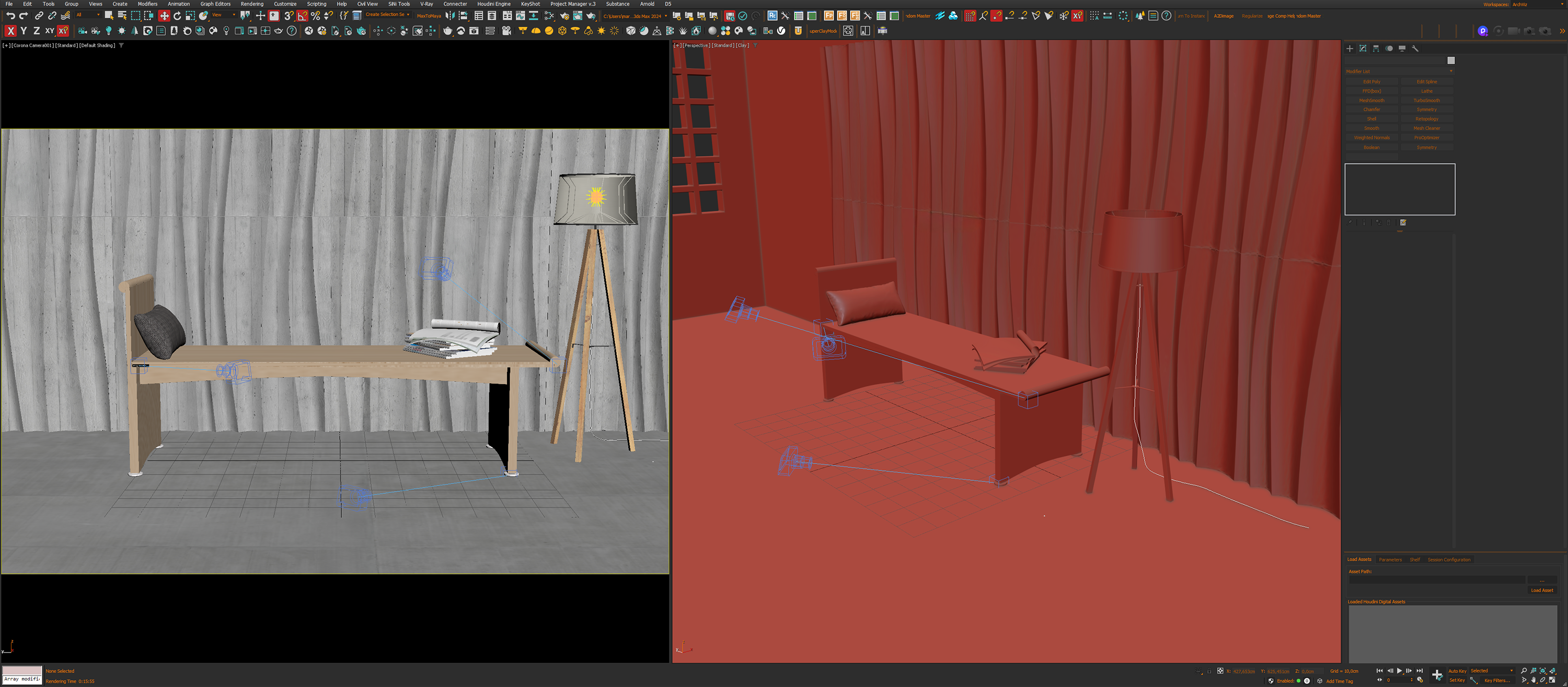
Basically I’m quite happy with the first result, of course I could certainly do more, but for now I can live with it. However, I will be creating my own „design variant“ in the coming weeks.
